Eric's Cool Plots and Data
I love to make plots. How often they get published is another
matter. Here are a few of my
favorites plots, some of which might even be useful.
Astronomy Plots
Sun Plots
Earthquake Plots
Hurricane Plots
Atmospheric CO2 and Global Temperatures Plots
other
Astronomy Plots
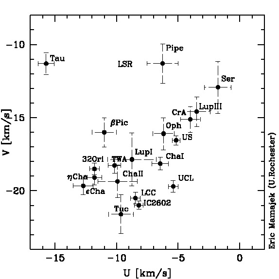
- UV Galactic velocity vectors for nearby young stellar groups (age ~< 50 Myr and d < 200 pc). Many of these groups are associated with the Sco-Cen complex (Sco OB2). Note the eerie similarity of the U and V velocity components of Lower Cen-Crux (LCC; the nearest OB subgroup to the Sun) and the IC 2602 cluster. Many of the velocity estimates were calculated by EEM and are unpublished, but available upon request.
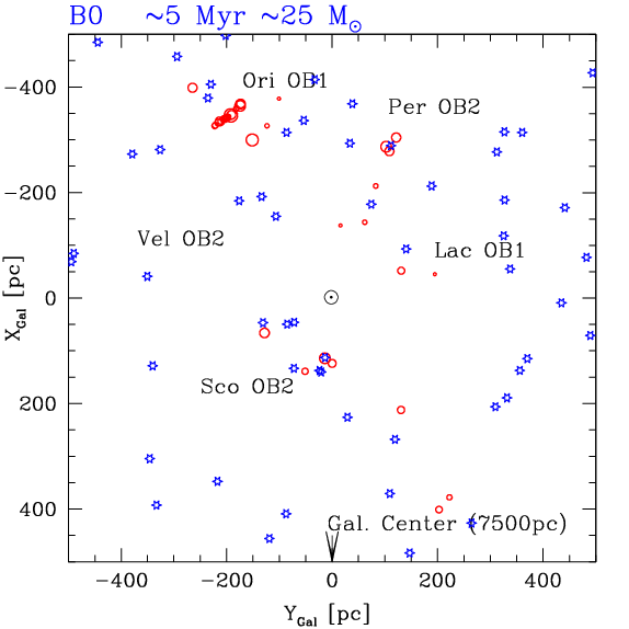
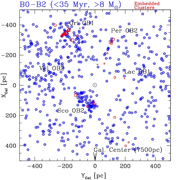
- Movie of the positions of
nearby B-type stars and embedded star clusters (red circles)
within ~500 pc. This still JPEG plot shows the positions of the
B0-B2 stars (~>8 Msun, ~<35 Myr, future Type II supernovae!)
within 500 pc along with the embedded clusters. The
movie shows the positions of B-type stars by spectral
subclass (*roughly* corresponding to a mean age and
mass). Embedded clusters from the catalogs of Porras
et al. 2003 and Lada
& Lada 2003 are plotted as red circles. The B0-B2 stars
are probable Type II supernova progenitors (>8 Msun). Note
that many or most of the B0-B2 stars are spatially
concentrated in groups ("OB associations"), and often they
are near embedded clusters which have been
forming stars within the past <1-3 Myr. To first order,
the positions of the B0-B2 stars are showing where the past
generation of embedded clusters was within the past ~5-20
Myr (their parent clouds having since been disolved through
winds and supernovae). Data is based on parallaxes and
positions from van
Leeuwen (2007) with spectral types compiled within the
original Hipparcos
catalog. Typical distance errors are ~10% at 100 pc and
~50% at 500 pc, and magnitude limits and extinction
preferentially remove distant stars. One point from the plot
is: there are often large numbers of supernova
progenitors in the vicinity of the largest, most populous
embedded clusters (and indeed some of their kin may have
supernovaed 'recently')
- Primordial
disk fraction vs. age for young cluster samples (or the
"Haisch-Lada^2
plot"). "Protoplanetary" disks appear to be nearly ubiquitous
around stars at ages of <1 Million years, but roughly half
are gone by age ~2 Myr, and they are nearly all gone by age ~10
Myr. This plot includes results from spectroscopic surveys
for T Tauri stars that are actively accreting, as well as
infrared surveys for optically thick disks (using mostly the
Spitzer Space Telescope). T Tauri stars that show signs of
accretion spectroscopically (e.g. strong Halpha emission)
usually have evidence for optically thick disks in the
infrared, and vice versa. Other authors have presented
revised versions of this plot over the years, so this one is
simply a 2009 update (for some other recent versions of the
plot, see Hillenbrand
2005 and Hernandez
et al. 2008). There appear to be real
cluster-to-cluster differences in the disk fraction at a
given age, and the evolution of disk fraction appears to be
a function of stellar
mass and multiplicity. The plot appears in a recent
review that I wrote for the Subaru conference in Kona on
Exoplanets and Disks (Mamajek
2009, arXiv:0906:5011).
- Here are some useful datasets for making color-magnitude plots of nearby stars and looking at their 3D (U,V,W) Galactic space velocities. I combined the revised Hipparcos catalog (van Leeuwen 2007) with the spectral type and V magnitudes listed in the original Hipparcos catalog (ESA 1997) to produce some data tables. HIP2008_SpT_Mv_75pc_plxSN8.dat gives HIP & HD numbers, astrometry (positions, proper motions, parallaxes), V and Hp magnitudes, B-V and V-I colors, and derived distances (beware of significant figures), and absolute magnitudes for ~13k stars apparently within 75 parsecs (parallax > 13.33 mas) with parallax errors smaller than 12.5%. So these stars ostensibly represented the nearest stars with negligible reddening (i.e. they are within the Local Bubble). The file HIP2008_SpT_Mv.dat represents the same data, but for all (nearly 111k) Hipparcos stars with positive parallaxes in the van Leeuwen revised Hipparcos astrometry catalog. The file HIP2008_UVW_SpT_Mv.dat contains astrometry, color-mag, and spectral type data for ~34k stars with postive Hipparcos parallaxes and measured radial velocities from the compiled catalog by Gontcharov (2006). The first several columns include the mean radial velocity along with the derived UVW (3D) Galactic velocities for those ~34k stars with measured radial velocities.
Note that these are *not* the tables used for the following plots, which were based on the Kharchenko et al. ASCC-2.5 compiled catalog of astrometry and photometry. (I did not have time to update these plots using the revised Hipparcos astrometry).
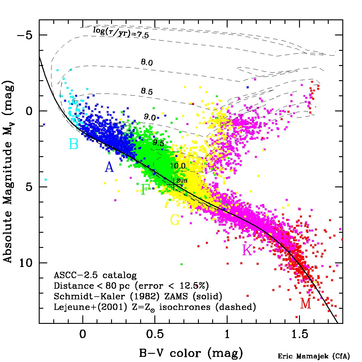
- Color-magnitude diagram (B-V vs. Mv) for stars within 80 pc, with color coding by spectral type
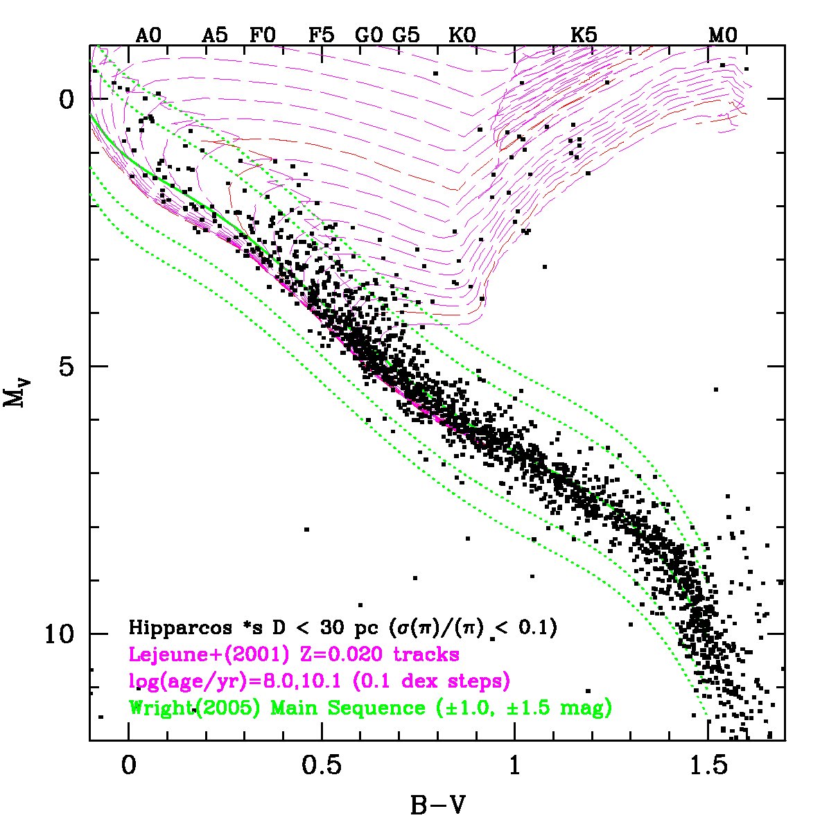
- Color-magnitude diagram (B-V vs. Mv) for stars within 30 pc, with solar metallicity evolutionary tracks
- Color-magnitude diagram (B-V vs. Mv) for the young (~5 million-year-old), nearby (145 parsecs) OB association Upper Scorpius.
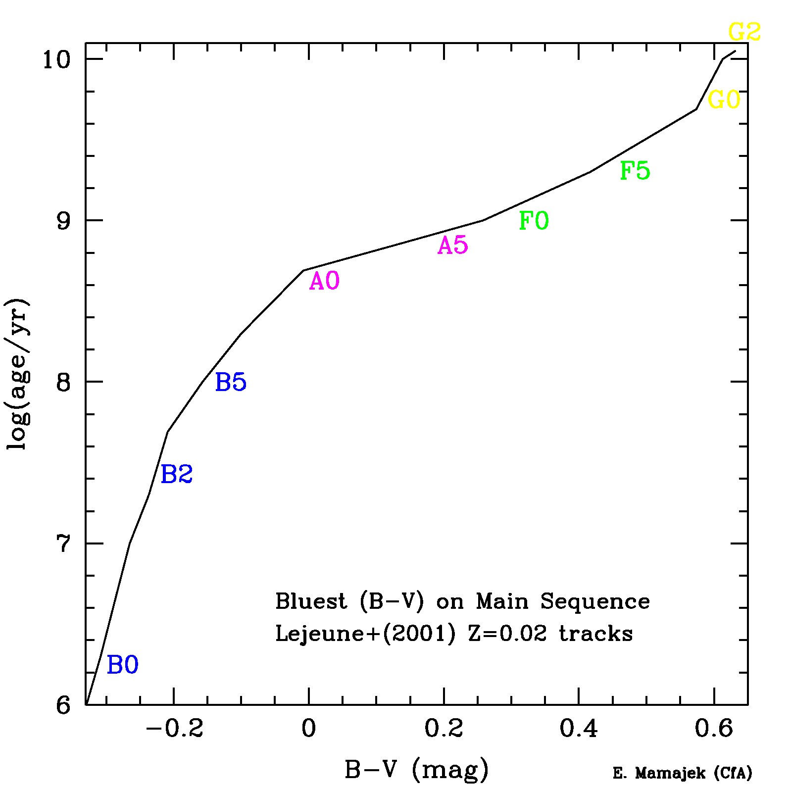
- Bluest Main Sequence B-V color for a given age/isochrone
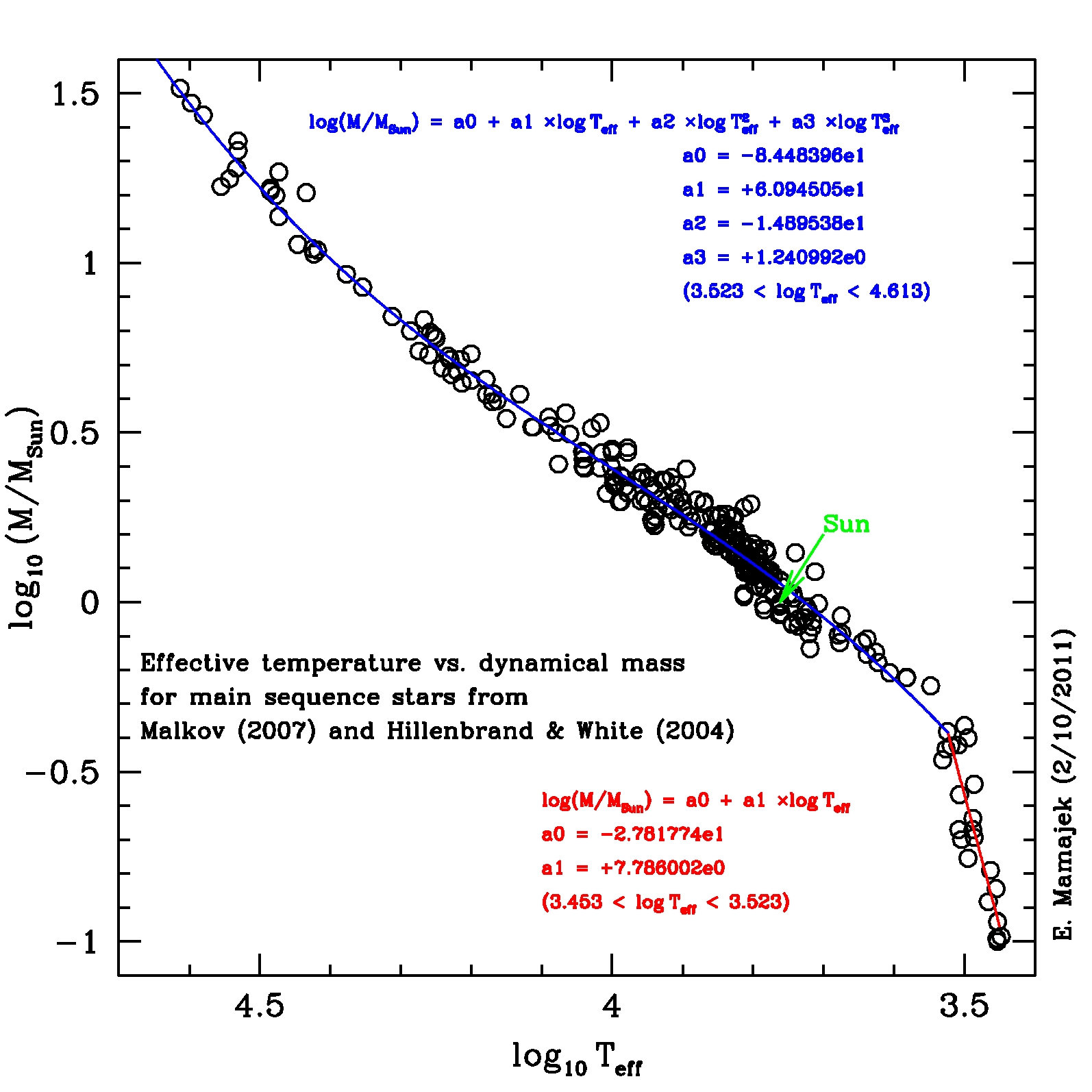
- Effective temperature (Teff) vs. stellar mass (M/Msun) for main sequence stars: data for binary stars with dynamical masses from and Hillenbrand & White (2004). Best fit polynomials are listed.
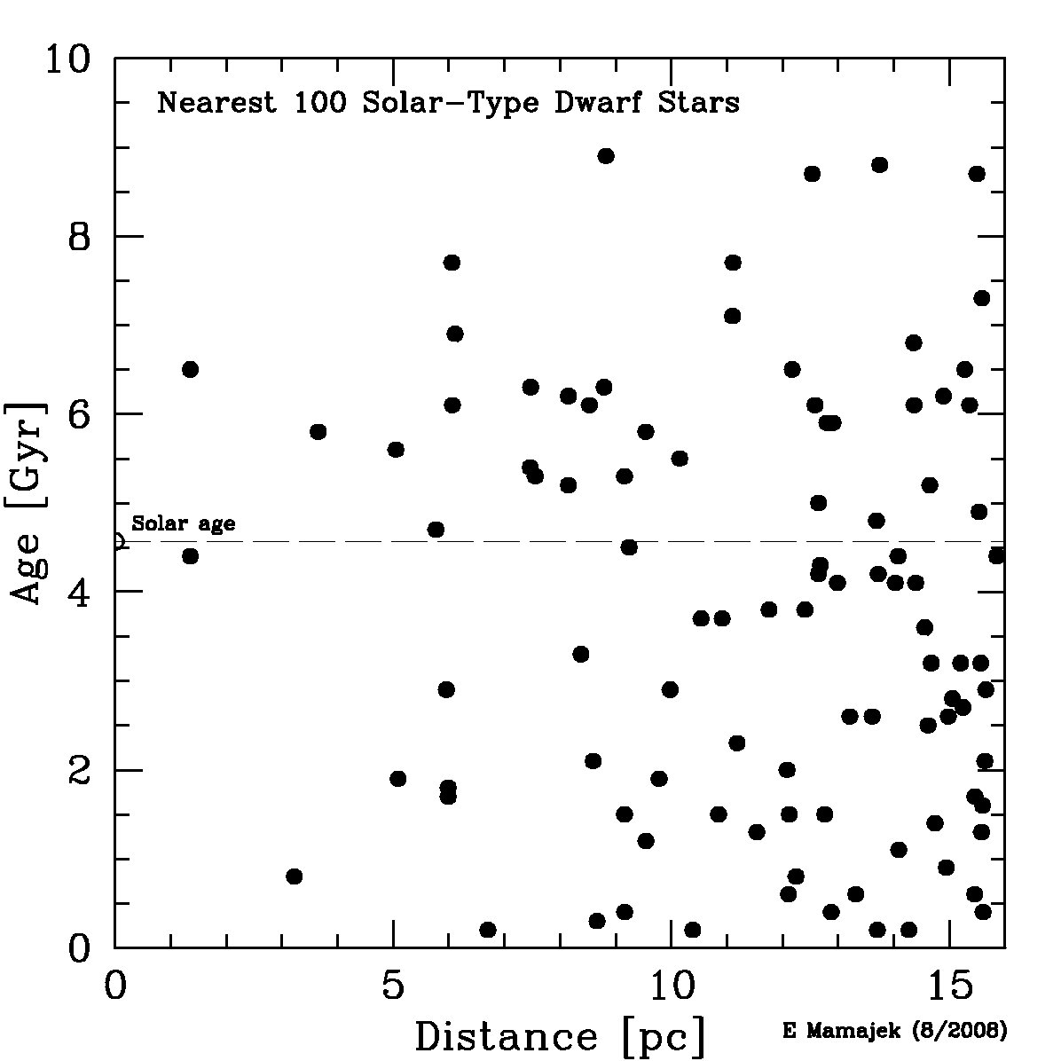
- Distance (parsecs) vs. age (in billions of years; Gyr) for the nearest 100 solar-type dwarf stars. Plot made from data in Table 13 of Mamajek & Hillenbrand (2008). The ages were inferred from chromospheric activity levels from the F7-K2 main sequence stars, using the revised rotation vs. age and rotation vs. activity calibrations from this paper. You can think of this as the distribution of ages of the nearest (potential) planetary systems to the Sun, for the nearest Sun-like stars in our Galactic neighborhood.
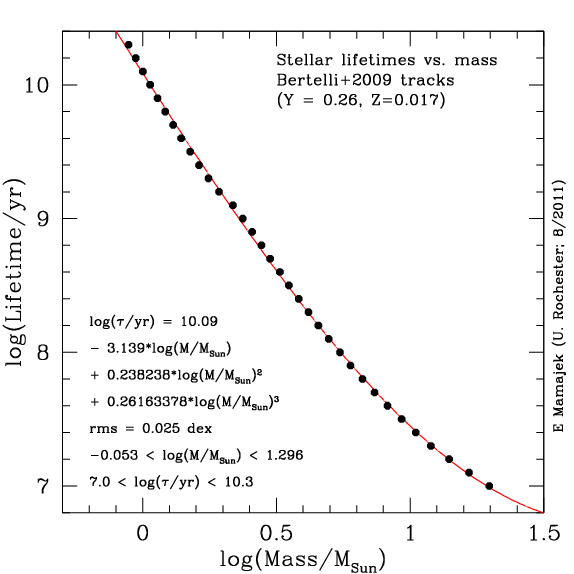
- Lifetimes of
stars as a function of stellar mass (revised 8/2011):
How long do stars shine? This plot shows the
approximate lifetimes of stars as a function of
stellar mass for initial models with approximately
protosolar helium mass fraction (Y=0.26) and metal
fraction (Z=0.017) using the Padova models (see Bertelli
et al. 2009 and website). Stars
more massive than 8 solar masses likely end their lives as
Type II supernova (with lifetimes of <39 million years).
8/14/2011: The previous plot had incorrectly listed the wrong
values. This has been fixed in the new plot. Unfortunately,
thanks to Google's robots, this incorrect image is archived
and will be accessible forever.
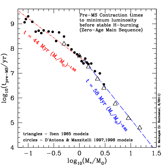
- Pre-MS contraction time versus stellar mass: How long does
it take a pre-main sequence star to contract and reach the main sequence? It takes
a 1 solar mass star roughly 44 million years to contract to the point at which hydrogen fusion accounts for nearly all of the energy production
(i.e. reaches the "zero-age main sequence"). Plot was contructed using
the D'Antona & Mazzitelli evolutionary tracks and results from Iben 1965. Stars below ~1 Msun spend most of their pre-MS epoch with mostly (or even fully) convective energy transport, whereas the more massive stars evolve to the main sequence having mostly radiative energy transport. (image last updated 8/2/2011)
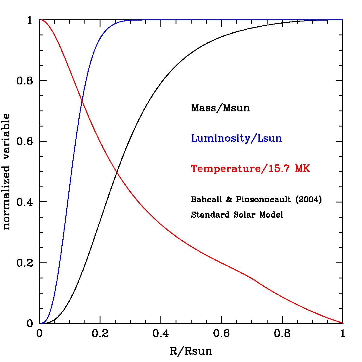
- Standard Solar Model - distribution of mass, temperature, and luminosity inside the Sun (from Bahcall & Pinsonneault 2004).
- Watch Proxima Centauri run!
- Cumulative
number of exoplanet discoveries versus time (last updated 28
November 2012). It appears that the number of known extrasolar planets
is doubling every ~30 months or so -- displaying a behaviour similar
to Moore's law, but with a slightly longer time constant. Note that
this count only includes the "confirmed" planets discovered from the
Kepler mission that have been included in
the Extrasolar Encyclopedia. There
are >2000 Kepler planet candidates that have not been confirmed via
other methods (doppler spectroscopy), however most are most likely
real, and hence the current census of exoplanets is actually well in
excess of >2000 as of late November 2012.
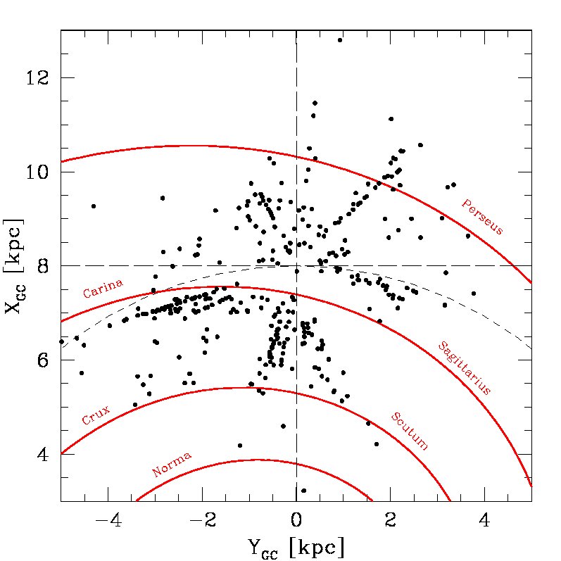
- The distribution of known O-type stars, viewed from above the Galactic plane, with spiral arms (from Vallee 2002). O-stars are from the Maiz-Apellaniz et al. catalog, where I calculated distances using the Mv and (B-V)o values from Martins et al. 2005. Here I assume the Sun is 8 kpc from the Galactic center. The anticorrelation of the O-stars with the arms appears to be due to the magnitude-limited nature of the O-star catalogs. There tend to be more dark molecular clouds in the "gaps" where there are no O-stars.
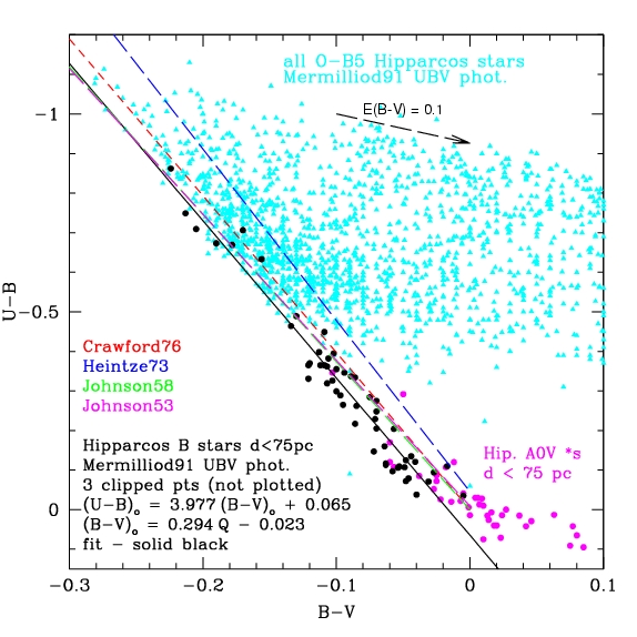
- B-V vs U-B color-color plot of OB and A0V stars. The plot gives an improved fit for deriving intrinsic (B-V) colors for OB stars using Johnson's Q-method (I had noticed that some of the formulae for deriving intrinsic B-V from the Q-method for high-mass members of the Sco-Cen OB association were giving more unphysically negative reddening values (E(B-V)) than one might suppose just from photometric errors. This plot shows why -- the previous calibrations do a somewhat poor job of fitting the "blue envelope" of colors for unreddened nearby B-type stars by attempting to force their
fit through (B-V, U-B = 0, 0) for A0V stars.
- "The Lithium Plot": A crude age indicator for cool stars. This is a plot of stellar effective temperature (Teff) versus the equivalent width of the Li I 6707A line for stars in clusters of "known" age. Stars appear to be born with a more-or-less "cosmic abundance" of Li (roughly 1 Li atom for every 500 billion hydrogen atoms!). Li is burned in stellar interiors at relatively low temperatures (~1-2 megakelvin), but it is
burned relatively slowly in stars like the Sun since they have thin convective shells that do not allow the Li to reach great depths and high temperatures.
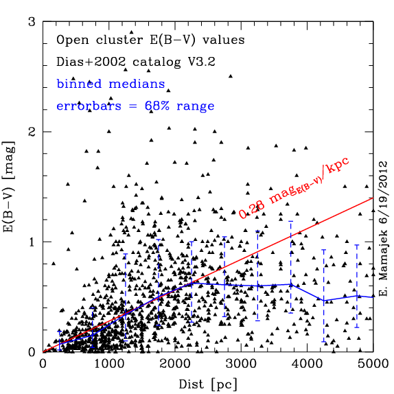
- Distance vs. E(B-V) for
optically visible open clusters from the Dias et al. 2002
catalog (V3.2) with ages > 10 Myr: this shows that the
median E(B-V) for known open clusters roughly
increases in reddening at a rate of ~0.28 mag(E(B-V))/kpc
until distance ~2 kpc, then plateaus - presumably due to
selection biases (more reddened clusters have been harder to
find). I've removed clusters <10 Myr as those may
preferentially inhabit regions near dense molecular
clouds. Since Av ~ 3.1*E(B-V), this slope translates to ~0.87
mag/kpc in V-band extinction, close to the canonical values
of ~0.7-1.0 mag/kpc often quoted. Note that the 68% scatter
in E(B-V) in a given distance bin is ~100% of the median value
(demonstrating the lack of utility of a mean extinction slope).
- Mark Heyer's (UMass) velocity map of Taurus as traced by 12CO emission. This movie passes you "through" the Taurus molecular clouds (one of the nearest star-forming complexes) in velocity space, as traced by detections of a carbon monoxide line with the FCRAO radio telescope. Red lines are polarization vectors.
Sun Plots
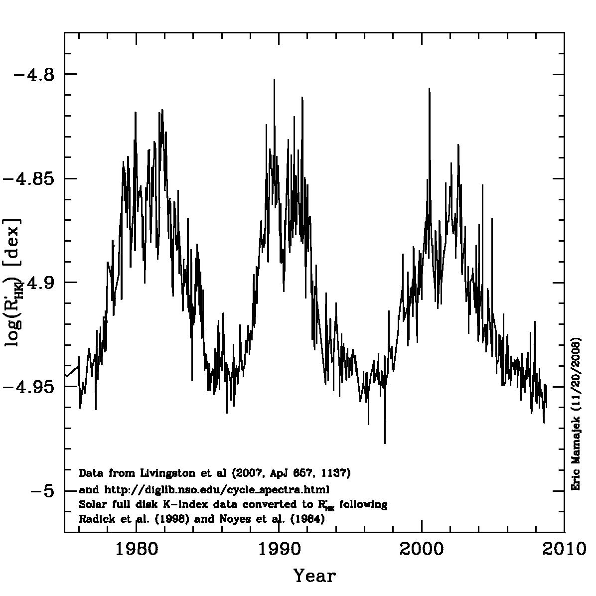
- Solar Chromospheric Activity vs. time (1975-2008). Using full disk solar K-index measurements from the NSO (Livingston et al. 2007) and converted to chromospheric activity index logR'HK via relations in Radick et al. (1998) and Noyes et al. (1984).
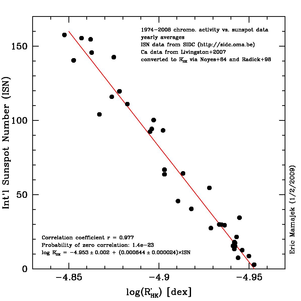
- Solar Chromospheric Activity vs. International Sunspot Number (1974-2008). Using full disk solar K-index measurements from the NSO (Livingston et al. 2007) and converted to chromospheric activity index logR'HK via relations in Radick et al. (1998) and Noyes et al. (1984). Sunspot data are from the Solar Influences Data Analysis Center. The correlation is very strong (Pearson r = 0.98), and the minimum logR'HK value is roughly -4.95 for sunspot number (ISN) equal zero.
Earthquakes Plots
Here are a few plots related to the annual number of
strong earthquakes recorded worldwide each year. I keep
hearing people make vague statements about how they think
there are more strong earthquakes now than in the past
(usually based inexplicably on global warming or 2012
mysticism). So I decided to look for myself.
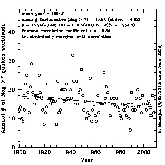
- There is NO evidence that the annual number of strong earthquakes
(worldwide; magnitude 7 or greater) is increasing with time on
timescales of decades to a century. Here is the plot
to show this point. The data come from these USGS
websites,
as is primarily based on the USGS Centennial catalog of strong
earthquakes between 1900-2001. The trend is generally flat, with a
statistically marginal (2.7sigma) anti-correlation (i.e. *decrease* of
the number of strong earthquakes with time!). The mean number of
strong quakes is around 16, and unsurprisingly to those used to
dealing with small number statistics (i.e. astronomers), the standard
deviation is approximately 4. That is, the scatter in the number of
strong earthquakes each year is more-or-less consistent with shot (Poisson)
noise. For a mean annual quake number of 15.9, shot-noise would
predict variation of +-4.0 (uncertainty = 0.4) quakes per year
(1sigma; 68%CL), and indeed +-4.6 is observed. So reading too much
into year-to-year variations is statistically fruitless when they are
varying more-or-less as predicted by shot noise.
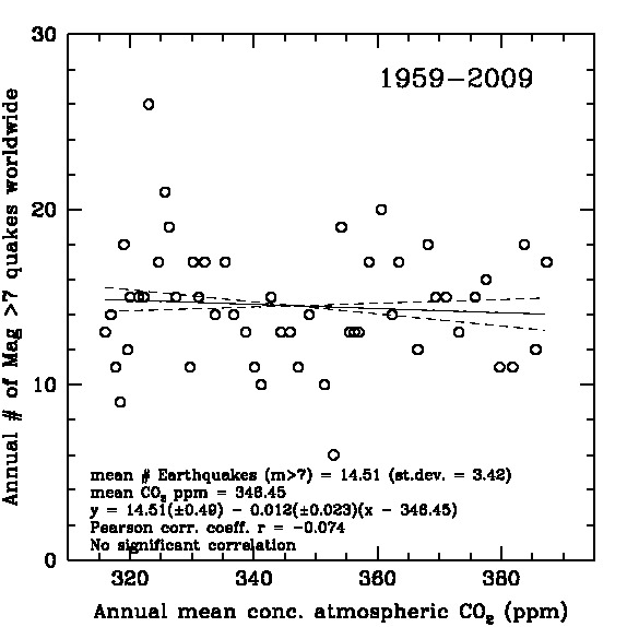
- There is NO evidence of a correlation between
the annual number of strong earthquakes (worldwide;
magnitude 7 or greater) and the amount of carbon dioxide
(CO2) in the atmosphere. Here is the plot to show this point,
and the data from
USGS and NOAA. The CO2 atmospheric concentration data is from the
Mauna Loa observatory (NOAA
and Scripps record starts in 1959). So while global warming may be a concern for other reasons, it seems silly to blame strong earthquakes on them, as some popular writers do.
- There is NO evidence of a correlation between the
annual number of strong earthquakes (worldwide; magnitude 7 or
greater) and global mean tempartures. Here is the plot illustrating this point
and the data
from USGS and NASA/GISS. The trend for 110 years of data
show a statistically marginal anti-correlation -- again,
it seems silly to blame strong earthquakes on warmer temperatures.
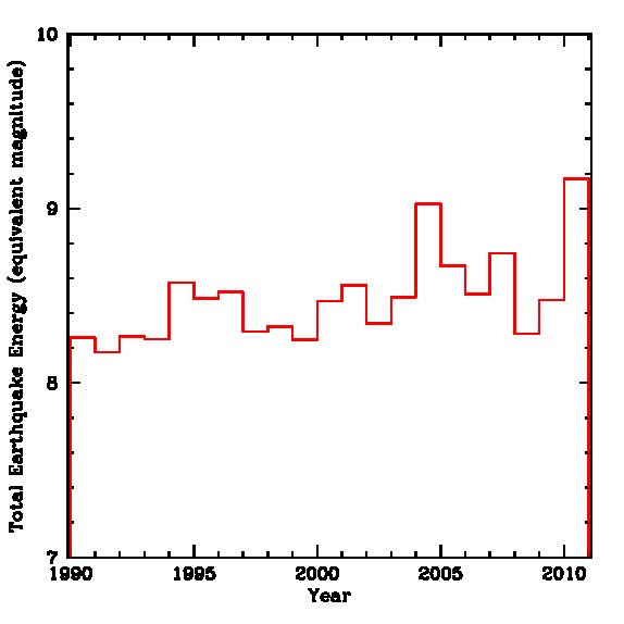
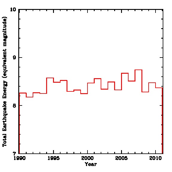
- Has the total energy released by earthquakes stronger
than magnitude 5 been increasing over time? Kurtis Williams
has shared some plots that he made showing the annual
summed energy of quakes stronger than M > 5 since
1990. Here
is the plot when the 2004
Indian Ocean Boxing Day quake and the 2010
Chilean quake are removed. I
don't have the numbers in front of me to play with to
statistically test, but to my eye there is no convincing
trend. Regarding people that count the "total" number of
earthquakes as a statistic, keep in mind that the records
become spotty below 5th magnitude or so, indeed the USGS states:
Starting in January 2009, the USGS National Earthquake
Information Center no longer locates earthquakes smaller
than magnitude 4.5 outside the United States, unless we
receive specific information that the earthquake was felt or
caused damage." This is one of the reasons that the
USGS's tally of total annual number of earthquakes dropped
by more than half from 2008 to 2009. So any trends based on
the "total number of earthquakes" are simply not useful
because of the selection biases that go into whether or not
a particularly weak quake is reported or not.
Hurricane Plots
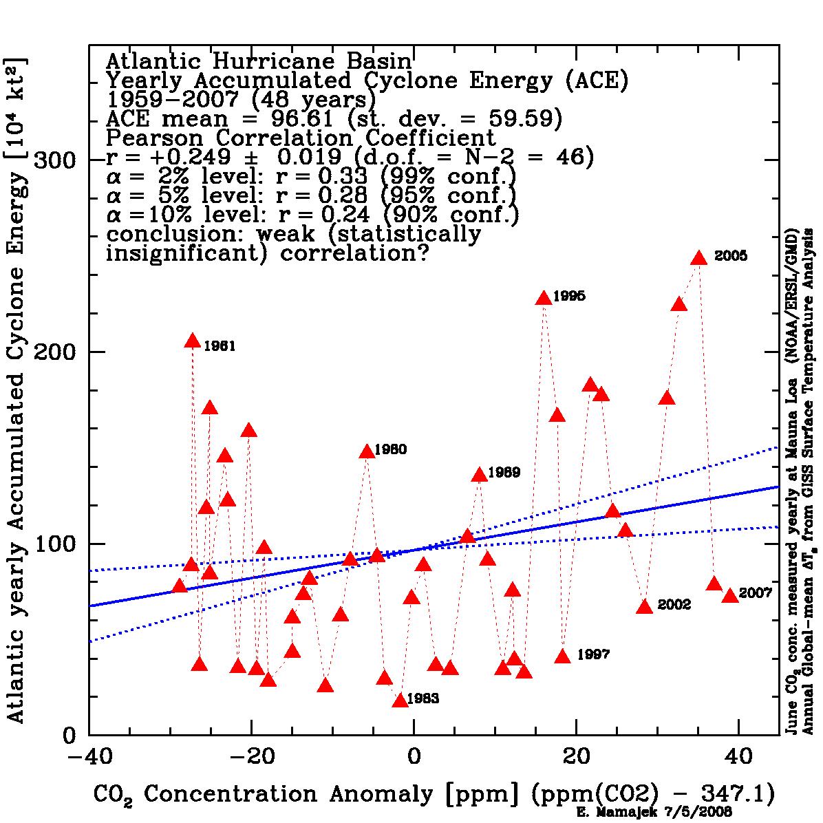
- Is there a correlation between atmospheric CO2
concentration and the
yearly accumulated
cyclone energy (ACE) for Atlantic tropical cyclones?
This plot represents the
modern era (1959-2007) where the CO2 measurements are from the
Mauna Loa observatory and the ACE are better constrained
mostly through aircraft reconnaissance, satellite imagery, and
related correlations
(Dvorak
technique). The Atlantic is the best studied region for
studying tropical cyclones, as the records for some other
ocean basins were poor even up until the 1970s. At least for
the Atlantic basin, the increase in annual accumulated cyclone
energy as a function of atmospheric CO2 is marginal at best --
the slope is positive, but not statistically significant
(1.6sigma).
- Is there a correlation between atmospheric CO2
concentration and the
yearly accumulated
cyclone energy (ACE) for Atlantic tropical cyclones? (Part
II) This plot covers
1851-2007, where the ACE values for the late 19th century and
early 20th century are
probably not
as accurate as modern values (as meteorologists were
lacking satellite imagery, aircraft recon, etc.), and based
predominantly on ship reports and on-land meteorological
reports.
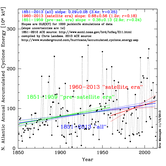
- Are Atlantic Hurricane seasons getting stronger with
time? Here is
a new plot of the
yearly accumulated
cyclone energy (ACE) by year from 1851-2013. ACE takes
into account the number and strengths of tropical cyclones
in a season, and is a better tracer of the destructiveness
of a tropical cyclone season than just counting storms (many
of which are weak, or missed in the pre-satellite era). The
ACE values are adopted from
the HURDAT
project compiled by NHC expert Chris Landsea. Note that ACE
values from the pre-satellite era (before ~1960) may be
missing tropical storms at sea that didn't impact land,
however these contribute little to the over ACE, which tend
to be completely dominated by large storms (as ACE goes as
maximum wind velocity squared). The trends of ACE with time
for the Atlantic Basin, while positive (i.e. increasing
slightly) do not appear to be statistically significant
given the uncertainties. The pearson correlation
coefficients for the slope of ACE vs. time is around 0.2.
Chris Landsea (NHC) has great analysis of tropical
cyclones and global warming worth reviewing. His conclusion
(which seems reasonable to me, given the data and its
limitations) is that: yes, global warming is real (most
likely dominated by anthropogenic forcing), but that the
effects on modern tropical cyclones are extremely tiny, and
almost unmeasureable (however the effects may become more
significant if the Earth warms further).
- Are the numbers of hurricanes and cyclones making
landfall worldwide increasing? The answer appears to
be no. I refer the reader to the recent statistical
analysis by
Weinkle,
Maue, Pielke (2012). Probably the best summary of the
situation is
their Figure
2 summarizing the number of cyclones by year by
basin. They conclude: "...our evidence does not support
the presence of significant long-period global or individual
basin linear trends for minor, major, or total hurricanes
within the period(s) covered by the available quality
data. Therefore, our long-period analysis does not support
claims that increasing TC landfall frequency or landfall
intensity has contributed to concomitantly increasing economic
losses." Long story short - one sees long-term cyclical
patterns of activity (e.g. 2004 & 2005 in the North Atlantic) and inactivity.
Atmospheric CO2 and Global Temperatures Plots
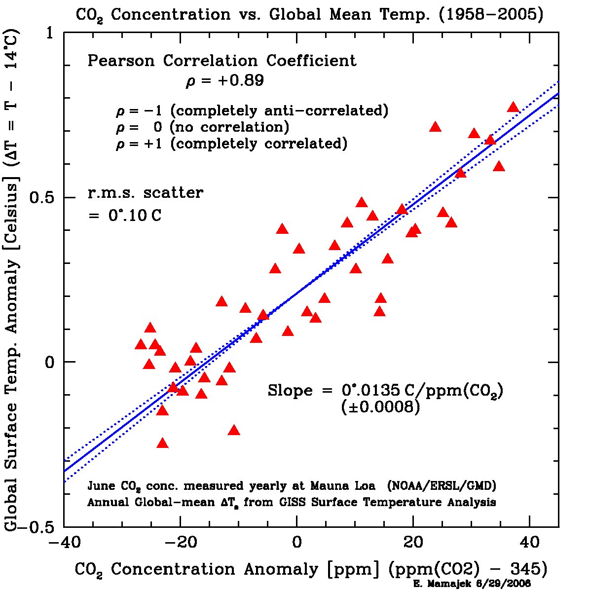
- Is there a correlation between atmospheric CO2 and
global temperatures?. Here is a plot for the period 1958-2005,
showing that YES indeed there is a correlation between CO2
and global temperatures (with a remarkably strong Pearson r
coefficient of +0.9!). Correlation does not necessary imply
causation, and there are indeed other strong effects to
consider, but there is a physical
mechanism by which enhanced CO2 can increase global
temperatures (see the so-called Keeling
curve of CO2 concentration vs. time). Here is a plot showing one group's decomposition of the global surface temperature trend into the predicted contributions from changes in solar radiation, volcanic aerosols, El Nino oscillations, and anthropogenic effects (from Lean & Rind 2009).
Others
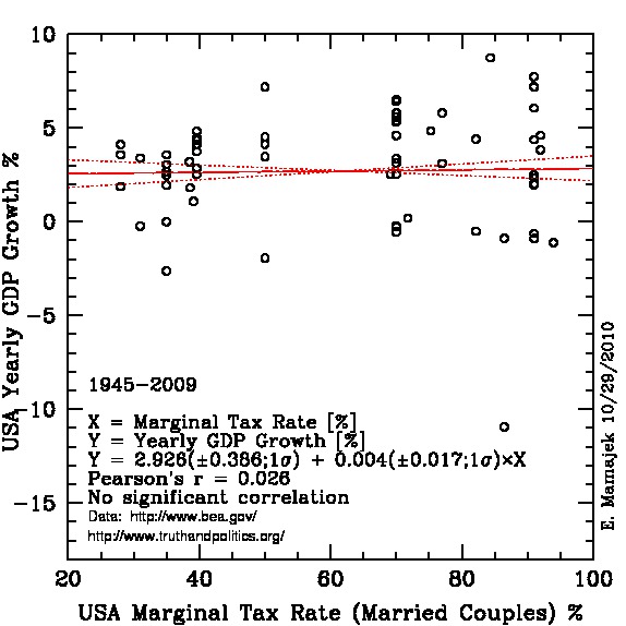
- Is there a correlation between marginal tax rates and
US economical growth as measured by yearly growth in Gross
Domestic Product?. Apparently
not in the period since the end of WWII. Typical yearly US
GDP growth is ~2.9% with up and down swings. The slope of
marginal tax rate vs. yearly GDP growth is statistically
consistent with zero.
Back